A simple plotting example
[1]:
import ee
import cartoee as cee
import cartopy.crs as ccrs

%pylab inline
Populating the interactive namespace from numpy and matplotlib
[2]:
ee.Initialize()
Plotting an EE Image on a map
[3]:
# get an earth engine image
srtm = ee.Image("CGIAR/SRTM90_V4")
[4]:
# specify visualization parameters and region to map
visualization = {'min':-500,'max':3000,'bands':'elevation'}
bbox = [-180,-90,180,90]
[5]:
# plot the result using cartoee
ax = cee.getMap(srtm,region=bbox,visParams=visualization)

ax.coastlines()
plt.show()
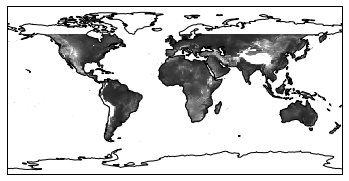
This is a basic example where we are simply getting the image result and rendering it on a map with the correct geographic projection. Usually we want to make out maps a little prettier…
Customizing maps
Here this example shows how we can plot an EE image with a specific colormap (from matplotlib), add a colorbar, and stylize our map with cartopy.
[6]:
from cartopy.mpl.gridliner import LATITUDE_FORMATTER, LONGITUDE_FORMATTER

# plot the map
ax = cee.getMap(srtm,cmap='terrain',region=bbox,visParams=visualization)
# add a color bar using cartoee
cb = cee.addColorbar(ax,loc='right',cmap='terrain',visParams=visualization)

ax.coastlines()

# set gridlines and spacing
xticks = [-180,-120,-60,0,60,120,180]
yticks = [-90,-60,-30,0,30,60,90]
ax.gridlines(xlocs=xticks, ylocs=yticks,linestyle='--')

# set custom formatting for the tick labels
ax.xaxis.set_major_formatter(LONGITUDE_FORMATTER)
ax.yaxis.set_major_formatter(LATITUDE_FORMATTER)

# set tick labels
ax.set_xticks([-180,-120,-60, 0, 60, 120, 180], crs=ccrs.PlateCarree())
ax.set_yticks([-90, -60, -30, 0, 30, 60, 90], crs=ccrs.PlateCarree())

plt.show()
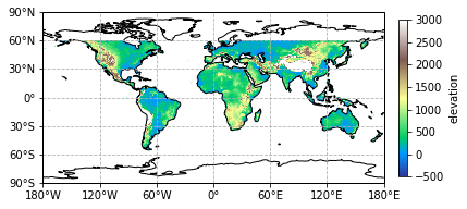
Now we have a map with some aesthetics! We provided a ‘cmap’ keyword to our cee.getMap function to provide color and used the same visualization and cmap parameters to provide a colorbar that is consistent with our EE image.
Plotting a specific region
A lot of times we don’t have global results and want to make a map for a specific region. Here we can customize where we make a map and plot our EE image results.
[7]:
# specify new region over Colorado
# showing the Great Continental Divide that splits the state
newRegion = [-111,35,-100,43]

ax = cee.getMap(srtm,cmap='terrain',region=newRegion,visParams=visualization,
               dims=2000)

# add a colorbar to our map
cb = cee.addColorbar(ax,loc='right',cmap='terrain',visParams=visualization)

# add a marker for Denver,CO
ax.plot(-104.9903,39.7392,'ko')
ax.text(-104.9,39.78,'Denver,CO')

plt.show()
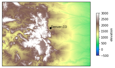
In this example, we took a global image (SRTM data) and clipped it down to the region required for plotting. This is helpful for showing map insets or focusing on particular regions of your results.
Adding multiple images to a map
Many times we don’t just have one image to show and cartoee allows for multiple images to be added to a map, and here is how.
[8]:
# send a processing request to EE
# calcualte a hillshade from SRTM data and specify the visualization
hillshade = ee.Terrain.hillshade(srtm,azimuth=285,elevation=30)

#create new visualization parameters for the hillshade and elevation data
hsVis = {'min':25,'max':200,'palette':'000000,ffffff'}
elvVis = {'min':0,'max':3000,'opacity':0.5}
[9]:
# set up a blank map
fig = plt.figure(figsize=(15,7))
ax = plt.subplot(projection=ccrs.PlateCarree())

# plot our hillshade on the blank map
# *note: we are using the cee.addLayer function here and
#        passing our map into addLayer as a keyword. This
#        will get that map with the image overlayed
ax = cee.addLayer(hillshade,ax=ax,region=newRegion
                  ,visParams=hsVis,dims=[2000,1000])

# plot SRTM data over the hillshade with some adjusted visualization parameters
# *note: we are passing the map variable again as a keyword
#        into the addLayer function to stack images on each other
ax = cee.addLayer(srtm,ax=ax, cmap='terrain',region=newRegion,
              visParams=elvVis,dims=[2000,1000])

cax = ax.figure.add_axes([0.8,0.25,0.02,0.5])
cb = cee.addColorbar(ax,cax=cax,cmap='terrain',visParams=elvVis)

# add some styling to make our map publication ready
xticks = np.linspace(-111,-100,5)
yticks = np.linspace(35,43,5)
ax.set_xticks(xticks, crs=ccrs.PlateCarree())
ax.set_yticks(yticks, crs=ccrs.PlateCarree())
ax.gridlines(xlocs=xticks, ylocs=yticks,linestyle='--',color='gray')
# set custom formatting for the tick labels
ax.xaxis.set_major_formatter(LONGITUDE_FORMATTER)
ax.yaxis.set_major_formatter(LATITUDE_FORMATTER)

# set a title so we know where it is
ax.set_title('The Great Continental Divde')

# add a marker for Denver,CO
ax.plot(-104.9903,39.7392,'ko')
ax.text(-104.9,39.78,'Denver,CO')

plt.show()
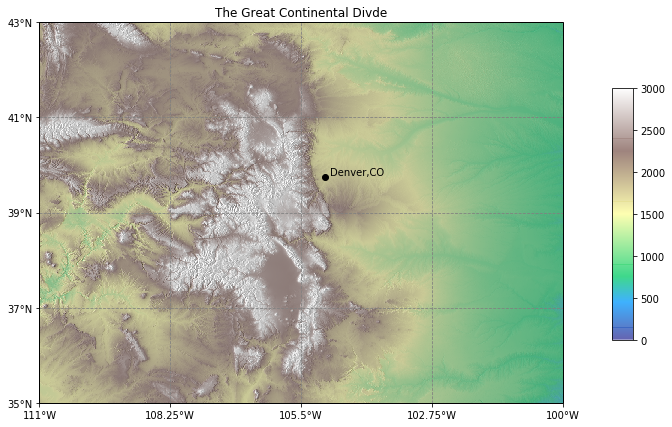
Now we have a nice map show elevation with some nice hillshade styling underneath it!